Adding value to age-old tools with a robust design language
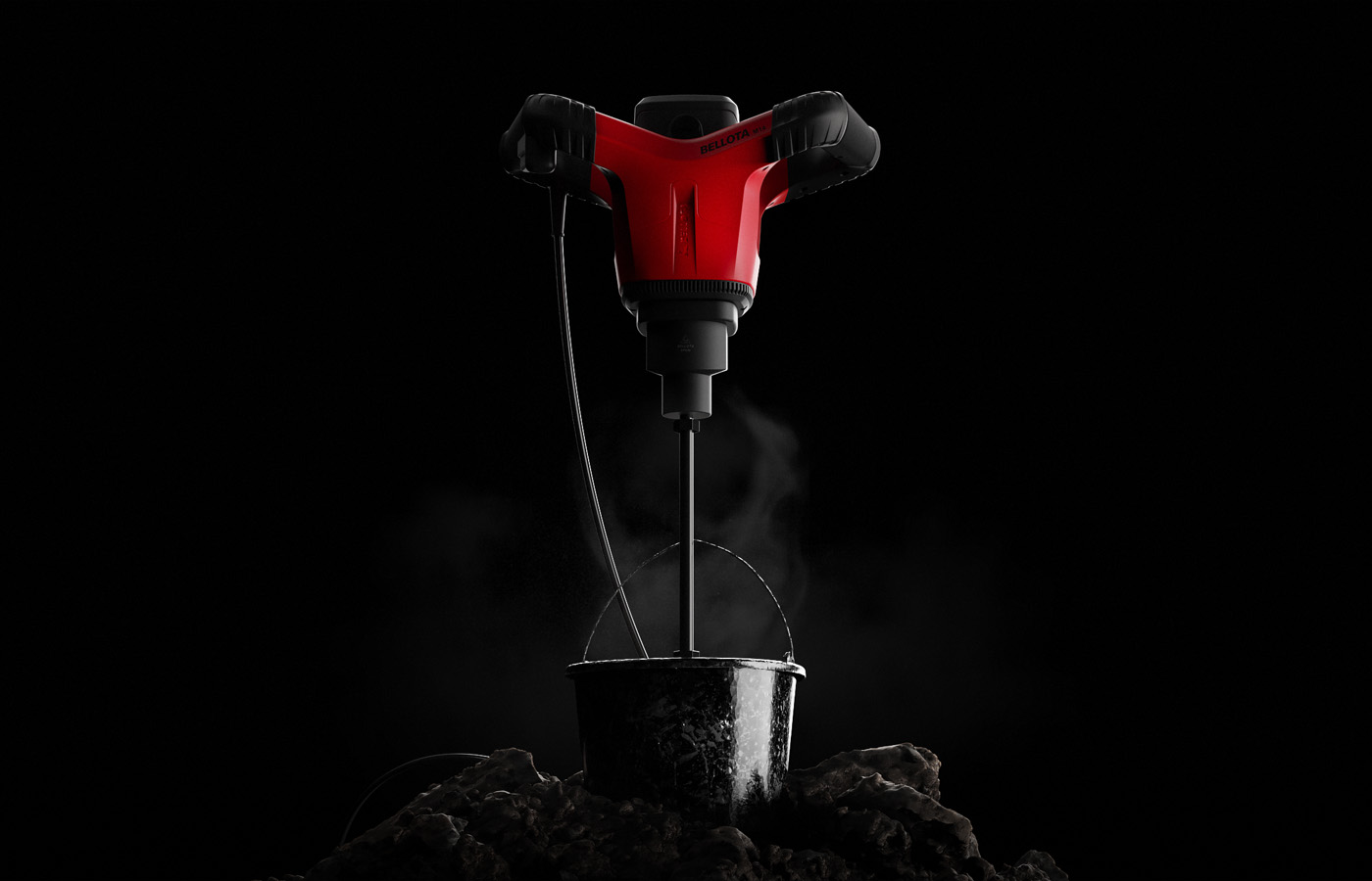
Bellota manufactures tools for agriculture, construction, and gardening, with a presence in international markets. Over the years, its catalog had grown by relying heavily on third-party products, which reduced consistency and made the brand's own products less recognizable and aligned with its image and values. The company committed to design as a strategic lever for growth. The goal: to design and deploy a new product development strategy under a unified aesthetic language that is robust and consistent with the brand's values and vision.
Define a 3-year product roadmap
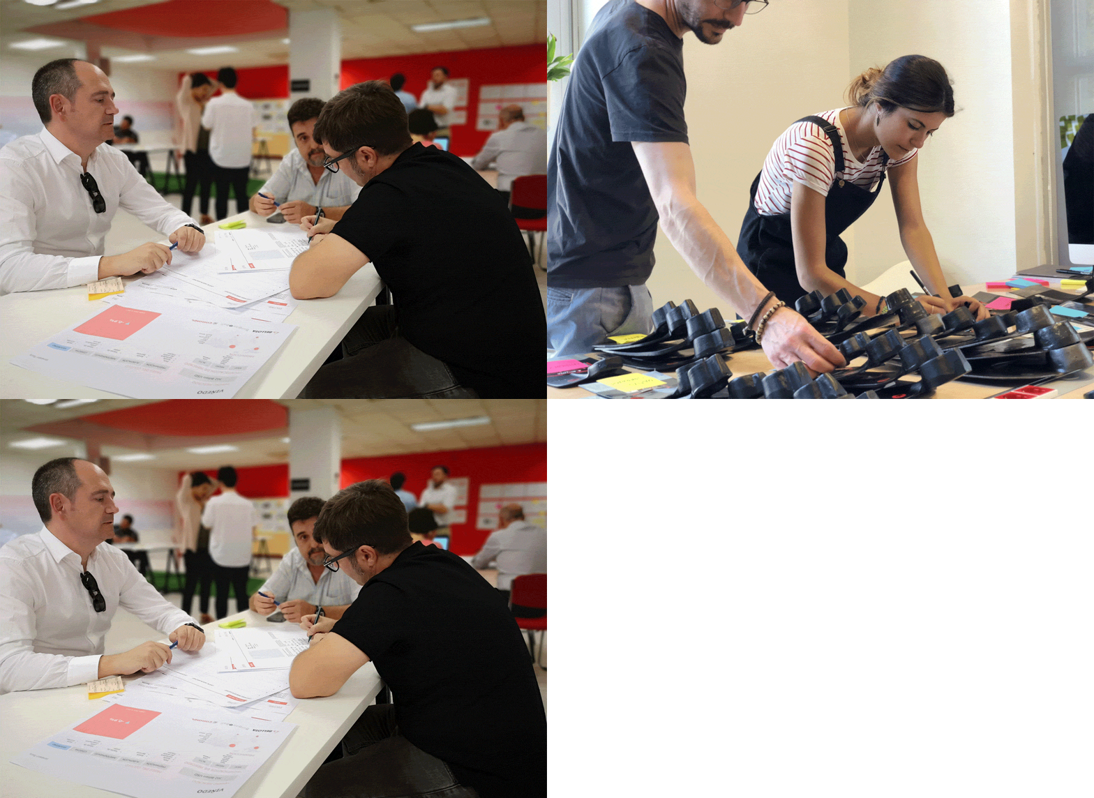
The project began with comprehensive research across three continents—Spain, Mexico, and Colombia—combining ethnography, market research, and UX research. Working with a dedicated in-house team, we integrated user-centered design, design thinking, and new product development methodologies to design a structured 3-year product development roadmap (2020-2022) that organizes and prioritizes launches by business unit.
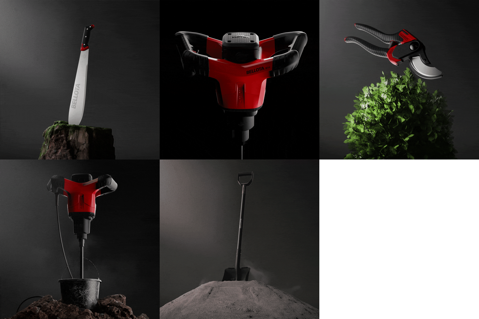
A recognizable and memorable Visual Design Language
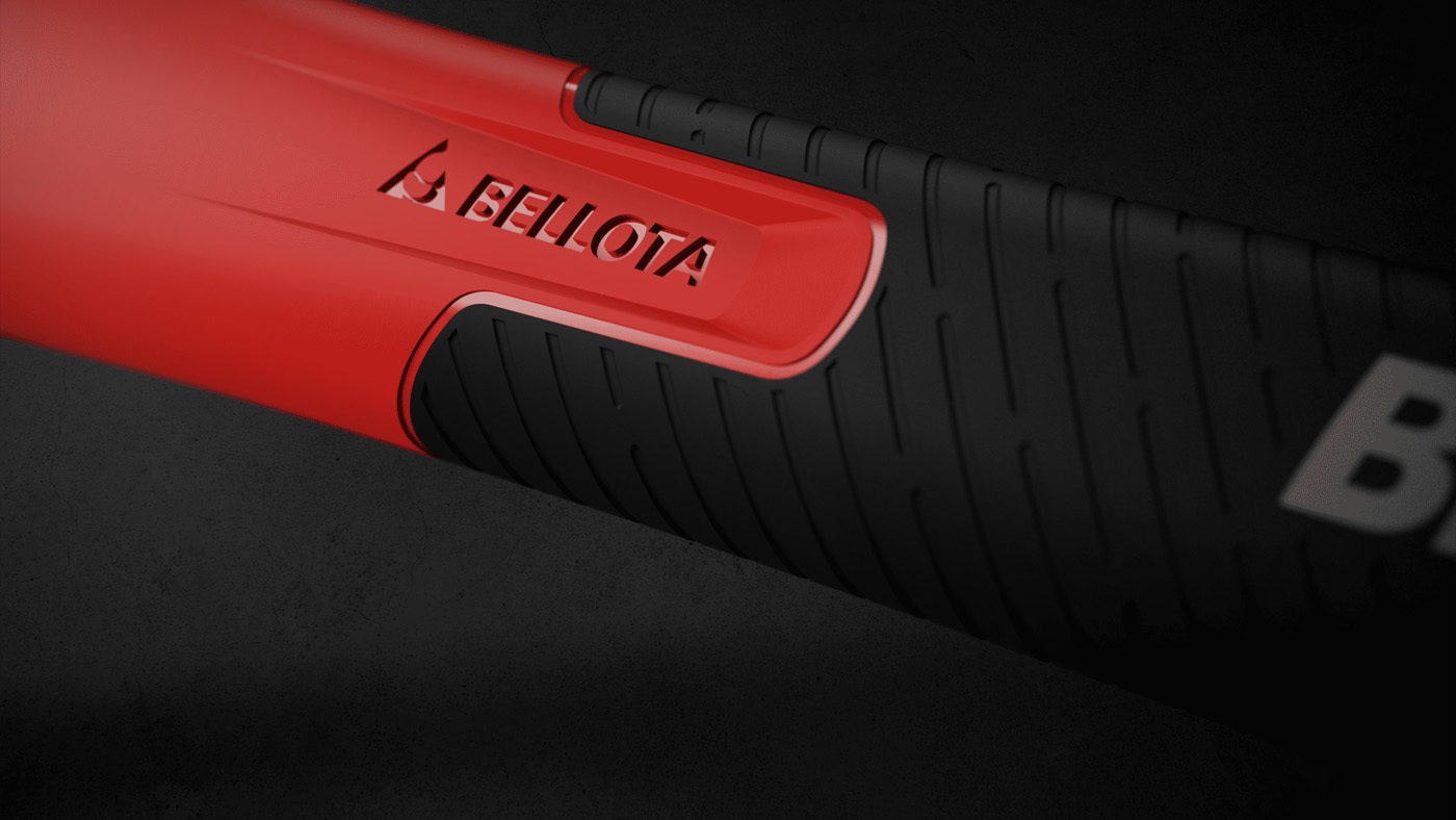
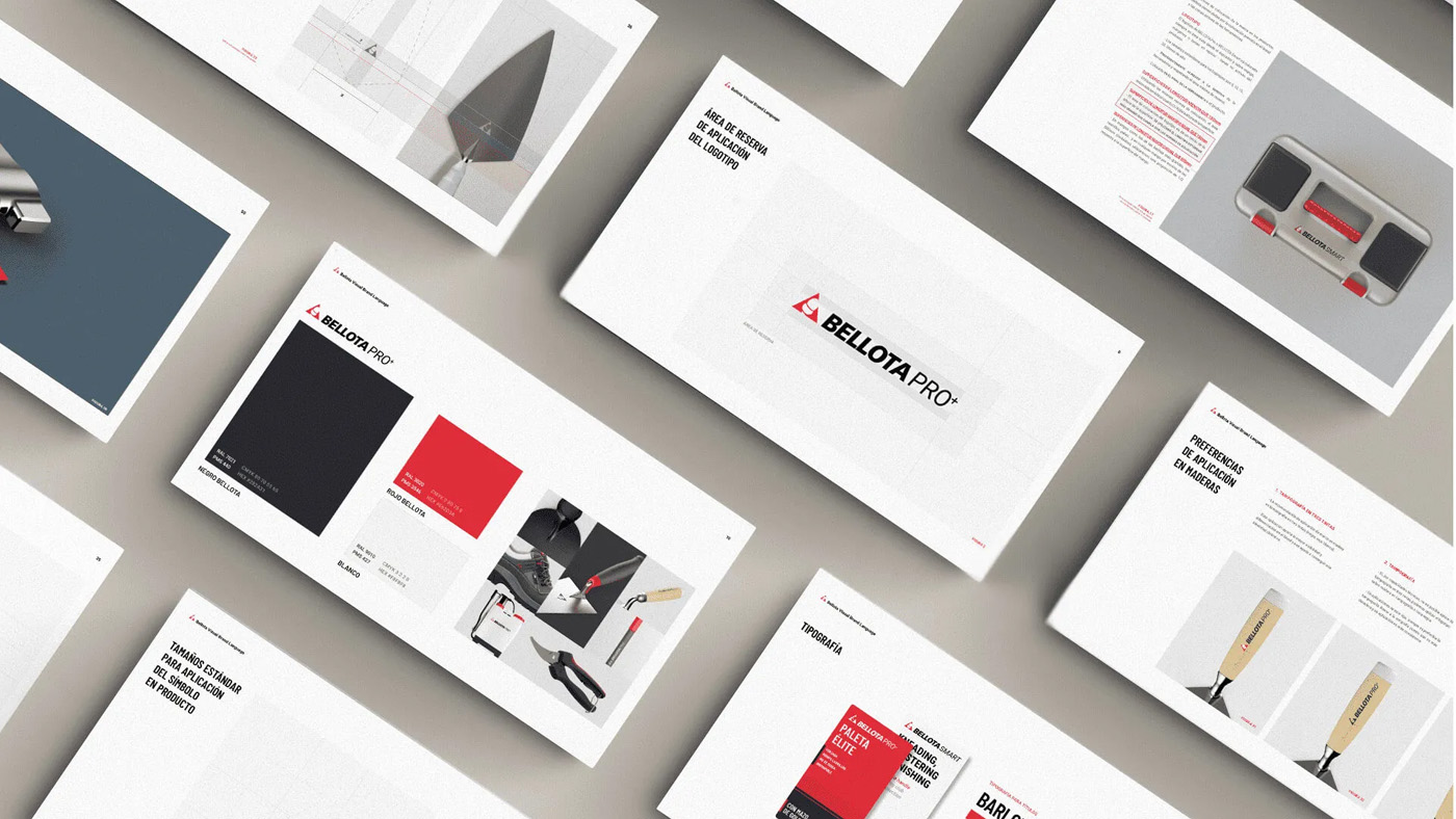
The resulting Visual Brand Language (VBL) is precisely codified, defining every detail that governs the brand's products: forging strokes, textures, color, grip, and finishes. This allows for the standardization of the visual line so that each product represents the brand's values and attributes.
We help shift the company mindset to embrace design as a strategic pillar, rather than just a final polish.
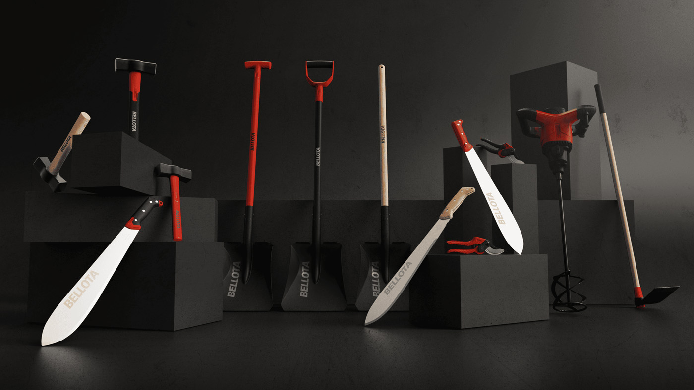
Outcomes